Project Two: Building a Framework for Infographics

After wrapping up the redesign of the NewsMag child site, I knew I needed a break from coding. Especially considering the amount of freelance I’m doing in addition to both part-time jobs.

My next project was to help create infographics similar to the ones that my former co-worker, Michelle Pais, created and rework them for the web. The main goal was to make sure that the presentation of the infographic created a framework so that future multimedia elements could easily be implemented across the site.

Challenges:

I knew that I wanted the infographics to give the illusion that they were interactive. The answer would not be a .swf file because it had to be something that was viewable on most mobile devices and compliant with responsive design.

Separating content from presentation:
Most importantly, it had to be easily editable. This is something that not many designers/developers seem to keep in mind when creating infographics for the web. They’ll make a gorgeous infographic that after a year isn’t meaningful. Nothing is worse than designing a gigantor infographic, and then one tiny detail changes and you have to open the Illustrator file up to even edit it, before reuploading it to the site.

Also, I consistently had to ask myself “Does this help the user understand the information or could it be better stated in a paragraph?” If the answer was the latter, then I knew I had to rework the design.
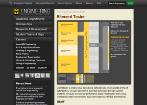

Above is the most recent version on the redesign site. I’ll post the link and finalized version once it’s complete.

Solutions:

In order to streamline the process of adding multimedia components to the site, Charlie created a framework called “elements” to present video, images, etc… using jQuery Cycle. At its most basic core, it’s a slideshow, just reworked to give the illusion of a presentation viewer similar to something you would build in Flash.

After finalizing sketches of the design of the infographic, I began to lay it out in Illustrator. I calculated the numbers and scaled all of the artwork by percentages, so that essentially the design could To make them easily editable, the design was broken into chunks and then placed on separate Illustrator artboards in one file. It’s a lot easier to export one Illustrator artboard than one huge image. The artwork was designed with minimal text so that additional information was added as a caption in WordPress. Once again, this was to keep everything easy-to-update.

After testing the theory of this, we realized that if the viewer revealed a glimpse of the next slide, then it would give the illusion that the viewer is moving through the infographic. This detail helps differentiate it from a static slideshow.

Looking back at some of my sketches, it’s obvious that the design changed quite a bit from the original plan, but for the best.

Now we have a framework to easily add more multimedia components throughout the site.

— Em

Doing a Volume of Work

Ira Glass on Storytelling from David Shiyang Liu on Vimeo.

For me, the hardest part of figuring out what I wanted to do later than the majority of my peers is feeling like I’m at the tail end of the career rat race. Of course it’s irritating to see less qualified peers land amazing jobs and move up in the world. But that doesn’t bother me as much anymore.

I’ve found that the most frustrating part of being new in the creative industry is the disappointment I feel with my work when it’s complete. I set very high standards for my projects and want to be proud of them. It’s discouraging to see the work of designers I respect and want so badly to reflect their caliber of design.

When I start to get overwhelmed by the thought of this, I force myself to watch a video I found on Vimeo (which, admittedly, is about every 2–3 weeks). There are a few things that bother me about the presentation but kudos to the guy who created this because kinetic type + After Effects = extremely difficult.

The video is reassuring for a couple of reasons:
1. Knowing Ira Glass (whom I respect greatly) struggled with this feeling speaks volumes to my confidence level.

2. The only way to move forward is to immerse myself in design — everyday — and keep pushing myself in my work.

Looking back at my projects from even January, I can see an enormous amount of progress. This is because between freelance, working at Stephens and working for Engineering, I’m designing or developing around 16 hours a day. If I’m not working, then I’m reading articles, blogs, books, watching videos, etc… that are design-related.

If you’re feeling stuck, or need a little inspiration, I recommend watching it, too.

– Em

Diving into PHP


For the Mizzou College of Engineering, I was presented with the opportunity to redesign and combine the News + Magazine archives child site, based on the existing WordPress framework Charlie uses for the rest of the site.

Challenges:
I can’t believe I did it. This project was my first time diving into learning PHP. At times it was horribly frustrating and codex.wordpress.org quickly became one of the top visited sites in my browser. Luckily, I had a great framework to reference and mentor to bug which helped me implement my mockups.

The goal of this redesign was to combine the News and Magazine posts into one archive page. Since Mizzou Engineer Magazine is published twice a year, I knew making the page look alive would be challenging.

Another major constraint was accommodating for the lack of visuals per issue. Not every story yields to gorgeous, hi-res images, but I figured that one per issue was a reasonable expectation.

Because of the technical language that coincides with this type of writing, the articles often have lengthy headlines. While wireframing this project, I had to keep this in mind.

As always, I knew making the site easy for the authors and editors to use was key in ensuring site longevity.

Solutions:
This project definitely taught me the value of working quickly and moving forward. If I was stumped on something, I learned the importance of switching tasks, coming back to it later with fresh perspective and giving it another shot. If it still wasn’t working, it was time to consult my resources.

In order for this page to not appear static, I decided the last four issues would be enough to entice the reader without looking dated. Including the magazine covers would solve two problems: it would help add visuals to the site while also providing the user with another way to find a story.

Since news articles are published more frequently than the magazine, the bottom portion of the site pulls in sticky news posts, which give the viewer the illusion that the site is updated more often than not.

To make the new features of the NewsMag archive page easy to use, I created custom post types and meta boxes. This would allow the author/editor to simply input information on the post page and upload the magazine covers into the media editor at the click of a button.

See the live site at www.engineering.missouri.edu/magazine-archives

Pixel Perfect Design.

Last Friday, I spent 2.5 hours staring at this:

Riveting, I know.

Why? Because in web design, pixel perfect (or nearly pixel perfect) design matters.

After implementing a navi for the NewsMag posts, I decided to make little arrows to help the user know to navigate from “Previous” to “Next.” I’d create 4 arrows– two white ones for previous and next and two gold ones for the hover effect. I’d splice the image so that I could create one PSD file. Should be simple, right? Of course making the arrows was easy. But getting them to line up perfectly with the 14pt “Previous” text next to it is easier said than done. Especially when you consider hover, padding and margins.

To make the arrows I used Photoshop, not Illustrator. This is because Photoshop handles pixels better than Illustrator. As always, Charlie showed me the importance of using a grid. Even though the arrows were the same height as the 14pt “Previous/Next” they looked smaller next to them on screen. Charlie taught me that for this it was important to rely on intuition and to make the arrows look optically perfect.

This is an extra step that a lot of designers would opt out of because clients would never notice. But it’s this attention to detail, obsessiveness for perfection and craftsmanship, that makes the difference between mediocre and great design.

Although it was definitely frustrating at first, I began to oddly enjoy the process. And at some point…It finally clicked. These details may seem meticulous– in fact, most people will never notice– but knowing everything was created with incredible preciseness is assurance that the designer cares and didn’t just slop it together.

And that level of high standards is something that I’ve found often gets left behind on the web.

– Em

Realish World: Day Two

After graduating this past weekend, I’ve faced the “what are you doing with your life?” question enough to drive me insane. Now, I can direct people to this blog to better explain what my plans are for the future.

Learning + Volume of work + Reflection:

I’ve decided that the best route for acquiring skills to become an interactive designer is to spend a few months intensively working at my part-time job at Mizzou Engineering. My awesome boss, Charlie, is allowing me to work on specific projects to help me fine tune these skills. I’m extremely excited at this opportunity, as it seems the work schedule is more like an apprenticeship. One of the requirements he has implemented is to record my thoughts as I go through this process. So, here goes.

First Reflection:

After sketching up some mock-ups of the first web design project I’m doing, I realized some of my inadequacies and some strengths.

Inadequacies:

I found it hard to sketch freely and quickly. I moved at a slower pace than I would have liked, but hope to get faster. At first, I definitely wasn’t confident in my designs and found them to look sloppy. I constantly questioned whether or not something was “convention in design” or if it was bad design. I need to work harder on selling the design, but I’m sure that will come with confidence. I also found that it was surprisingly helpful to let my mind wander as it naturally does instead of fighting to stay focused.

Strengths:

My enthusiasm for the project forced me to keep mocking up designs when I felt I was stuck. I also believe I do well when bouncing ideas around with other people.

Other lessons:

– thinking through some of the mechanics while creating wireframes  (how to implement it)

– importance of sketching a ton of mockups; a lot of designs won’t work

– setting a personal deadline to keep me accountable and on track


NYLON iPhone App: 3/5 Stars

Excellent job designing the iPhone app, NYLON and Mozine. It’s easy to navigate and consistent. The headlines are web/mobile friendly instead of being overly clever. It loads pretty quickly for containing a large amount of content. I also really enjoy the fact that I receive “free year digital subscription,” that anyone can have without registering. 🙂

There are definitely a number of development bugs, though. A few links will take me to blank pages and I have to exit the app completely to get back to the home screen. That’s something that not a lot of users are willing to put up with. It also requires an internet connection, so that’s kind of a bummer, but not really a big deal.

The articles are an appropriate length for reading on a mobile device and the design is simple. They make it easy to share content via social media. I like that the design is definitely consistent with the other platforms of NYLON. The designer/developer was careful to give enough room for links (as we all seem to have fat fingers, haha).

I especially like the photos page. NYLON handles pictures in portrait mode better than any other iPhone app I’ve ever seen, especially considering it’s a magazine. They could improve it, though, by adding a caption that appears when you tap the navigation.

I’d also like to see the photos center themselves (or another similar solution) when in landscape mode to get rid of the awkward white space on the side. They also need to fix the top navi, since it’s not accessible in landscape or when I go from landscape to portrait.

It’d be nice to be able to comment on an article, also.

Right now I give the NYLON iPhone app overall 3 out of 5 stars. The good thing is that the app serves a purpose since the NYLONmag website isn’t mobile friendly at all. Working out the kinks/bugs in the app would definitely bring it up to a 5.


– EPS

NYLON Blog: Tag! encourages audience engagement

NYLON Magazine’s Blog appears to understand the importance of audience engagement, as they dedicated an entire section for user-generated content. The section “Tag!” is a place where users submit photos of graffiti they’ve spotted or created around the world. Users can write a small blurb explaining where the graffiti was found and their thoughts on it. So cool!

Because it’s such a specific niche, Tag! has been extremely successful. The Blog uploads one submission per day. It’s easy, doesn’t require a ton of work on either side of the production and provides fresh, visually-appealing content for the blog site.

The only suggestion I’d make was to have a very short header at the top of the Tag! category page, so that readers quickly know what it’s about.

What a great way to get your audience involved and make them feel like a part of the team, NYLON. I think the blog for the publication I work for, Vox Magazine, should implement something like this.

– EPS

NYLON Magazine Digital Edition (Web)

I’ll let you in on a secret- NYLON Magazine’s website offers a “sneak peak” look at all of their issues in the past 5 years. That “sneak peak” happens to be the entire magazine. So if you click “The Magazine” on the navigation bar and then on any of the covers you can read the issue via zinio.

Although, it sometimes lags (most likely due to my computer/internet connection) zinio did an awesome job creating this viewer. The interface design is beautiful and it gives you numerous options on how to view the content. Not only is it available in full screen mode, but it also allows you to embed any page/issue by providing you with the code.

I absolutely love that NYLON has a digital free access version of their magazine. I’m able to take screenshots for posts instead of tediously scan the print copy. The only thing that confuses me is why do they call it a “sneak peak” if it’s the whole magazine? As a print subscriber, it leaves me wondering why I should pay if other people can just read it online for free. Also, why in the world would they charge for the iPad version of the magazine if they don’t for the web version?

Obviously, there are many pros to being a print subscriber and having the actual magazine in your hands to read. And on the iPad, I can’t access the digital website viewer because it uses Flash. Part of me is wondering whether the full digital magazine is only supposed to be viewable if you’re logged in and you’re a print subscriber. This would make more sense. However, to clarify: I think it’s great that the digital version is free, just confused as to why.

Below I tried to embed the NYLON November 2011 zinio viewer, but WordPress ain’t havin’ it. It limits the number of times you can zoom, so I’d just look at it on NYLON’s site. I included the embed link, though!

http://www.zinio.com/widget.jsp?is=416196386&pg=1&type=lgNylon-Nov-11

NYLON Magazine: November design critique

November Overall Design Rating: 4.8 / 5

The America issue, Rachel Bilson cover

Alright, officially my favorite issue. It just seemed like everything was planned to a tee. I loved all of the “hand drawn” elements throughout the issue. The content was original and didn’t seem repetitive of the past two issues I’ve read (which tends to happen with other magazines).

What worked:

Illustrations in this issue were awesome.

Seriously. I can’t say enough good things about them! You can tell a lot of thought was put into each illustration and that the artist went the extra step to put the finishing details on it. I especially enjoyed the ‘Merica bald eagle wearing the sunglasses.


– The overall layout of the must have (“mass appeal”) sections really improved from the last issue; they’re so much easier to read and don’t overwhelm me. The “face value” page was really well designed- especially liked the illustration of Dr. Brandt!

Page 72 “Shop America”

The photo clippings were a great choice to help style the page. It shows the extra effort of the designer to not just slap photo and copy on the page and call it done.

Page 78 – 79 “Free Style”

Love the illustrations throughout this spread. Adding just a touch of color helps keep the reader interested without overwhelming them. Also, the choice to make each illustration size different helps balance the design.

Page 85 “Keep Sake”

What a cool craft! Seriously can’t wait to make this. At first I was going to comment that the photos weren’t large enough for the reader to see step-by-step, but I revoked that thought after realizing they were perfectly fine.

Page 96 “Greatest Hits”

Thank you, NYLON, for finally understanding that when showcasing watches readers want three things: designer, price and an up-close view of the face. No one else seems to understand this simple request. Simple, but great job designing this article.  Also, a sidenote, the model’s facial expression made me laugh every time I turned the page.

Page 107 – 111 “Beauty Blender”

Love that I can compare the looks all at once (page 107) or look at the up-close photo (makes it easier to see the details and imitate it).

Radar section (115-129)

Radar had it together this issue. Every page entertained me and I loved the “Bands Across America” feature. Separating bands by location was a great idea. Engaging content and well-executed design. My only complaint is that after reading that I spent 3 hours downloading music. Thanks for providing the excuse to procrastinate, NYLON.

What didn’t:

 Page 80-81 “Apple of my eye”

Each page individually looks awesome, but as a spread…eek. The vibrant colors on the right completely clash with the musk, fall design on the left. Neither page is an advertisement so maybe there was miscommunication or a tight deadline?

America issue: wait, why?

I love America just as much as the next gal, but why denote November 2011 as the America issue? Why not July  or November 2012 (when there’s a presidential election)? Hmm, still thinking this one over.

Also, it should be noted that I enjoyed the Bare Minimum and Rachel Bilson articles. Just sayin’.

– Emily Paige

NYLON’s Social Media Presence

As social media becomes a more integrated part of audience engagement, it’s important that publications use these tools to their advantage. These platforms can enhance the user experience and help promote content. That is, if the social media is used effectively. It seems that the defining characteristic of successful social media users is consistent and relevant content.

So, is NYLON using social media in an engaging and effective manner? Overall, yes. NYLON appears to be killing the social media scene.

Twitter:

With more than  400,000 twitter followers, @NylonMag has a strong online presence for a magazine of its size. They usually tweet around 15-20 times per day, depending on content. Some people might find this to be low, but as a Twitter user, I find it to be a good balance between consistently tweeting and being obnoxious.

They establish a dialogue with their readers, crafting tweets that are always clever but never too confusing. Also, their Twitter handle is short which makes it is for users to RT them.

NYLON Magazine has separate Twitter accounts for their international editions and for NYLON Guys. However, none of these are nearly as successful as @NylonMag.

Facebook:

NYLON’s fanpage on Facebook has 207,000+ likes on Facebook. I repeat, more than 200,000 people have liked their magazine on Facebook. To put this into perspective, Harper’s Bazaar only has around 87,000 likes on Facebook. Marie Claire has around 112,000. Vogue has…well…2 million for the U.S. edition, but that’s because it’s Vogue. I’m throughly impressed with this, although it’s not hard to see why so many people are a fan of the magazine. Throughout the day, they post short headlines and link to their site.  They’re consistent, their dialogue is friendly, simple and engaging and their content is interesting. Every post has dozens (if not a hundred) of likes, multiple comments and usually a share.

Google+:

Although this didn’t overtake Facebook as the “social media experts” predicted, it’s still important to maintain an online presence here. It’s another way to connect with the reader. NYLON doesn’t appear to have a fan page on Google+ but users are sharing NYLON’s content with their friends on it.

YouTube:

NYLON’s YouTube channel, NYLON TV, does a great job of giving the user another element to the story for a richer experience. The videos vary from behind-the-scenes interviews with cover shoots to reviews of what they’re listening to. They’re always light-hearted and fun to watch, making it very addicting when on AutoPlay. They have a loyal subscriber base of around 55,000 people and more than 46,600,000 total channel views! This is a great ad revenue for NYLON, too, as they have unobtrusive cosmetic advertisements on their videos and channel page.

NYLON TV producers know the secret to audience engagement: keep it as concise and interesting as possible. Their videos are rarely more than 2 minutes long.

Myspace:

I didn’t even realize that people, none-the-less publications, still had Myspace pages but good for you NYLON! Although, it doesn’t appear they’ve logged in for a month or posted any content in a year and a half. That’s ok because I don’t think anyone else has, either.

RSS:

Where is your RSS feed, NYLON?! Oh, there’s the link! At the very bottom of the page. Yes, I know I can go to Google Reader or Safari and manually subscribe to your site, but I’m a lazy user and I want someone to do it for me. NYLON has the XML files for their RSS feed, they just need to implement a “subscribe” or RSS button next to the other social media icons.

Klout:

@NylonMag has a Klout score of 67, which is pretty impressive. Their influential topics are fashion, entertainment and media so they’re right on target.

Update: According to Klout, NYLON ranks #7 as an online influencer of the topic of fashion. This is a huge achievement considering they’re ahead of Harper’s Bazaar and behind NYTimes Style.